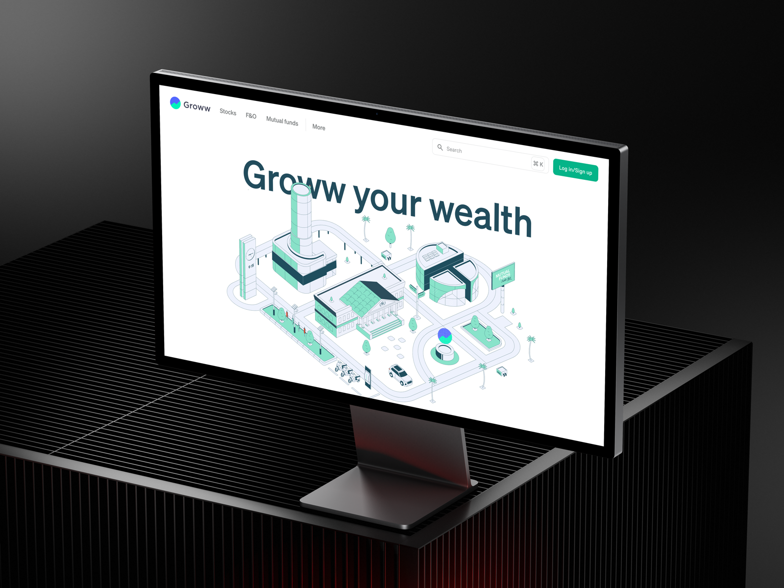
I designed the original landing illustration for groww.in. It worked, but it had run its course. Groww had shipped new products since then, and the illustration hadn't kept up. It also sat at a contrast level that didn't hold attention the way the rest of the redesigned homepage did. Nobody asked me to fix it. I pitched the update myself because I could see the gap before anyone flagged it.
The Concept
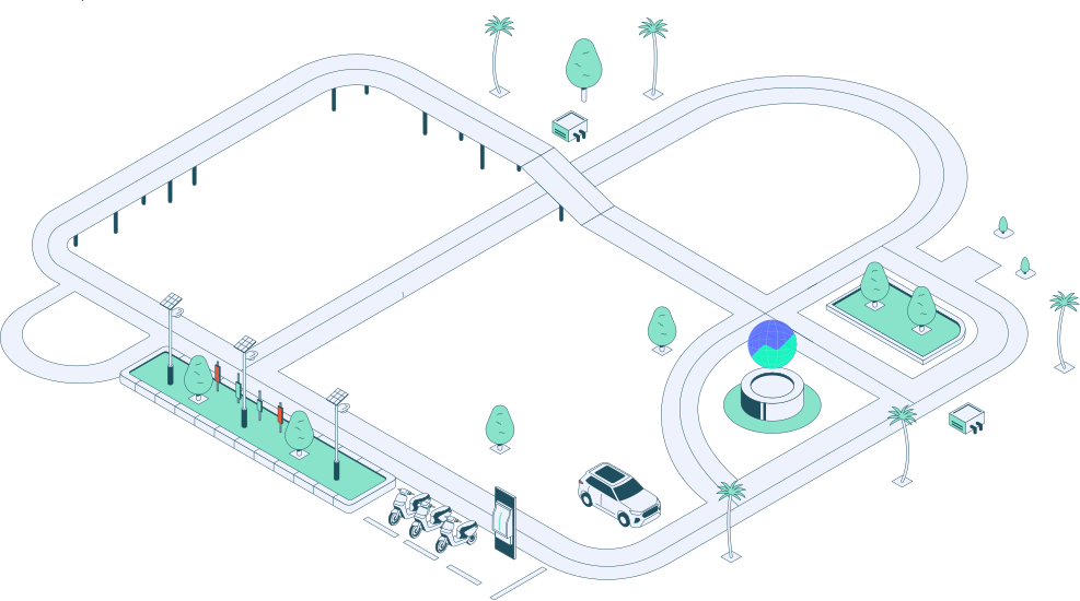
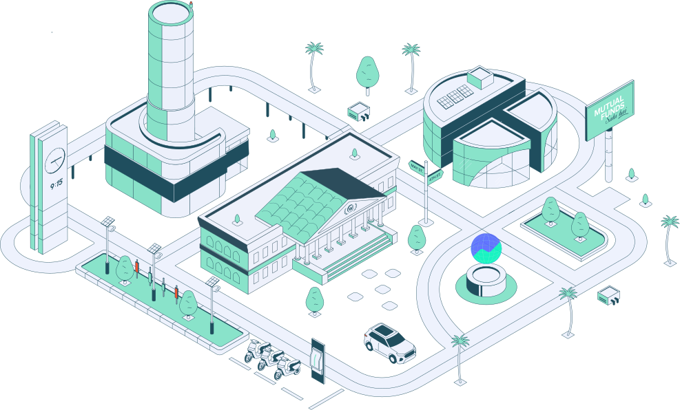
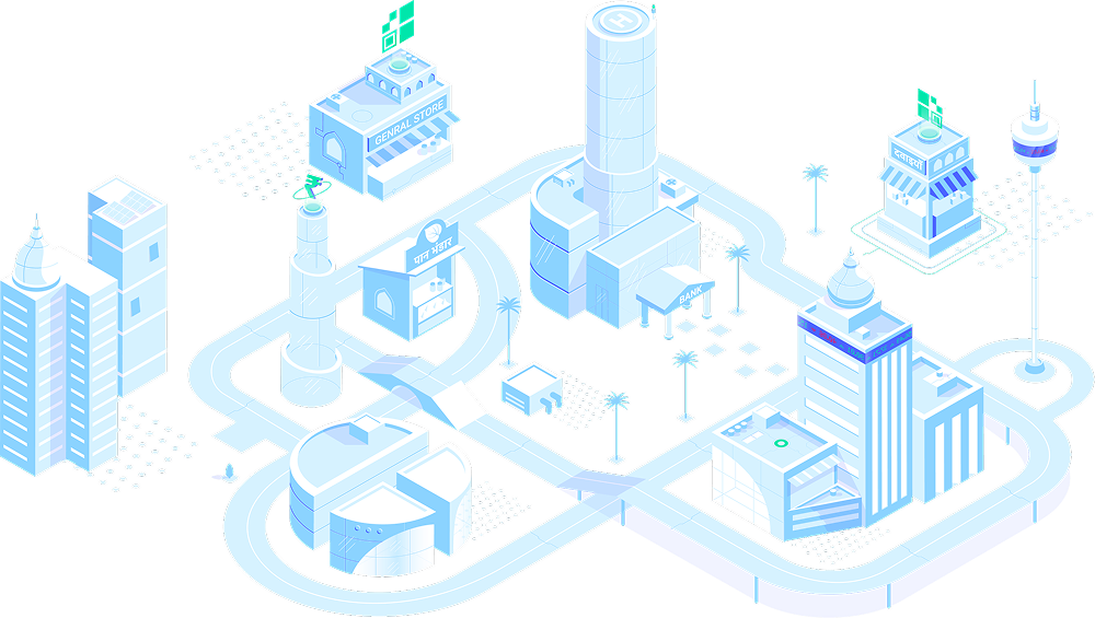
The idea was to stop treating the illustration as decoration and start treating it as a map. Groww is a financial platform with multiple products under one roof. So I built a skyline where every building is a product, and the skyline itself is the platform.
I called it the Growwverse.
Each structure had to do two jobs at once: read as a building, and read as the product it represents. That constraint shaped every form decision.
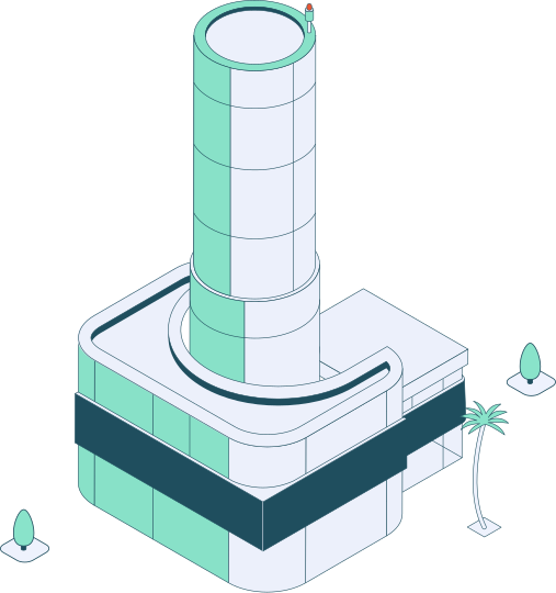
Stocks
A tower drawing from the BSE building's silhouette. Stocks are the most recognizable, most "stock market" part of the platform, so the building borrows directly from the most recognizable stock exchange architecture in India.
Mutual Funds
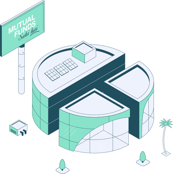
A circular structure, pulled straight from the MF icon already used inside the Groww app. This one wasn't inspired by an external reference. It's a direct translation of an icon users already recognize, scaled up into architecture.
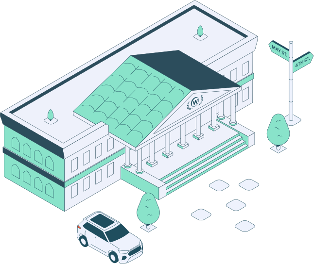
Wealth
An old bank building. Wealth management is about trust built over time, not speed. A classical, slightly aged facade signals stability in a way a glass tower never could.
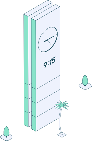
915
A clock tower. Trading runs on time, on the second. A clock face was the most direct way to say "speed and precision" without using a single icon from the actual product UI.
Other Assets
The Road Map