
(SELECTED WORK) — DESIGN SYSTEM
Visual
Design System
For Wealth
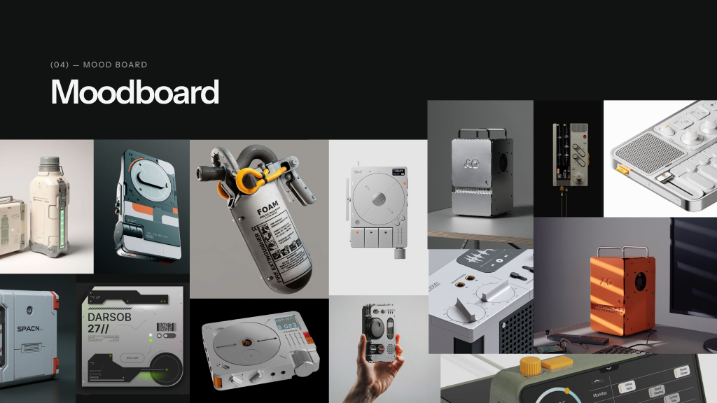
Wealth by Groww's design system has premium dark surfaces, considered typography and a custom isometric illustration register that signals craft, calm and considered finance.
(06) — ILLUSTRATION TYPES
Three sizes, one register.
Every illustration in the Wealth library belongs to one of three sizes. Same visual register, same lighting and palette — only the volume changes with the surface.

360 × 180 PX
Cover · Splash · Onboarding

180 × 180 PX
Empty states · Confirmations

80 × 80 PX
List items · Inline accents
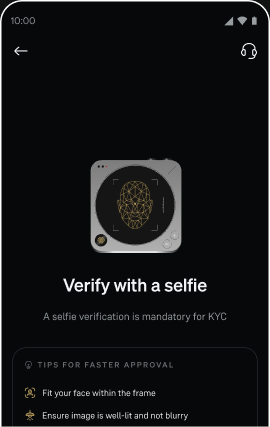
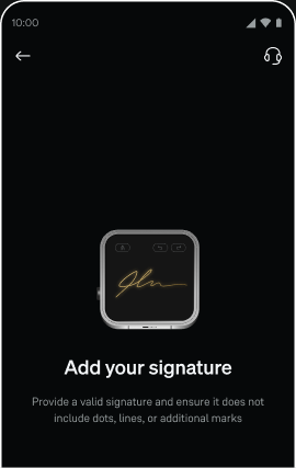
(07) — HERO ILLUSTRATION
Hero illustration.
A single isometric machine, lit from the upper-left, sitting in negative space. The hero is the moment the user enters a flow — calm, deliberate and quietly impressive.

SURFACE
Cover · onboarding
FRAME
360 × 180 px
PALETTE
Gold + matte greys
(08) — CONSTRUCTION · HERO
Construction.
Each hero is built on a 30° isometric grid. Light source upper-left at 45°. A single gold accent per scene, never two. Shadow tones stay within the same hue family.

GRID
30° isometric
LIGHT
Upper-left, 45°
ACCENT
One gold note per scene
STROKES
1.5 px, no anti-alias
(09) — HERO IN USE
Hero illustrations.

(10) — HERO SHOWCASE · II
More hero scenes.

(11) — SPOT HERO ILLUSTRATION
Spot hero.
A square 180 × 180 frame. Used for empty states, confirmations and section headers — quieter than the hero, but still load-bearing.

(12) — CONSTRUCTION · SPOT HERO
Construction · spot.
Same isometric system, square frame. Object centred, clear margin on all four sides — the spot has to read at half its rendered size.

FRAME
180 × 180 px
MARGIN
24 px on all sides
FOCUS
Single object, centred
(13) — SPOT HERO LIBRARY
Library.
Five spot scenes share the same matte palette, isometric grid and a single gold accent.


(14) — SPOT HERO IN USE
In context.
The spot illustration sits naturally inside the Wealth product surface — empty states, confirmation screens, milestone moments.

(15) — SPOT ILLUSTRATION
Inline spot.
The smallest unit in the system. 80 × 80 px, designed to read at list-row size — paired with text, never floating alone.

(16) — CONSTRUCTION · SPOT
Construction · inline.
Drawn at 80 px, hinted to a 1 px grid. Clarity wins over fidelity at this size — every shape simplified to read instantly.


SIZE
80 × 80 px
GRID
1 px hinted
DETAIL
Reduced silhouette
(17) — SPOT IN USE
Spot illustrations.
(18) — SPOT IN USE · II
A whole product.
The system holds together because every illustration — hero, spot or inline — speaks the same visual language. One register, three sizes, one product.