(SELECTED WORK) — VISUAL SYSTEM
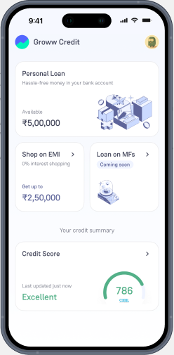
Groww Credit
Visual
System.
An isometric illustration system for Groww's credit product — futuristic devices and compact cityscapes that make loans, EMIs and credit scores feel approachable, structured and unmistakably Groww.

(04) — CONSTRUCTION
Isometric, because it earns clarity.
Isometric beats true perspective for product illustration: a 3D effect without the complexity. Clean axes, consistent angles and the same shadow rules everywhere — illustrations slot together cleanly across icons, spots and heros without re-engineering depth for each surface.
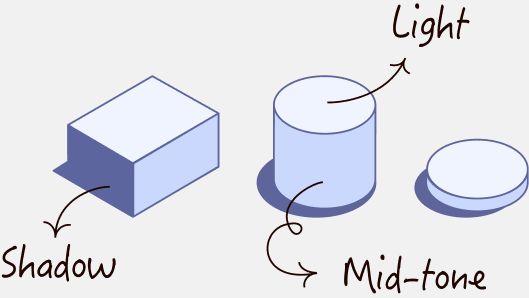
01
Light
#F0F4FF
02
Mid-tone
#CBDAFF
03
Shadow
#5E659A
(05) — SCALE RATIOS
One ratio. Three sizes.
Every illustration sits inside a 1:1 frame. Only the size of the frame changes — 120px for product icons, 240px for spot heros, 360px for full marketing heros. Same construction, different volume.
ICON
120 px

SPOT
240 px

HERO
360 px
(06) — ICONS LIBRARY
30+ icons.
The icon library covers every credit surface — instruments, security, time, money, devices, appliances. Every glyph is built from the same isometric grid and three-tone palette, so the library reads as a family the moment two icons sit side by side.


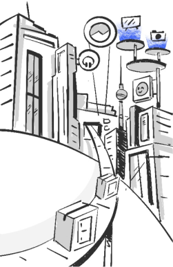
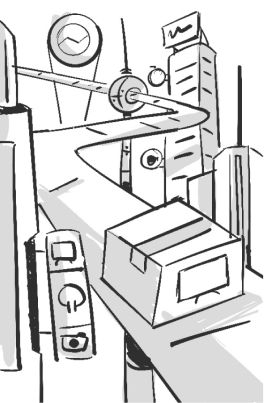
(07) — CONCEPTS & SKETCHES
Three directions, one chosen.
Before the system locked in, three directions explored. Hand-drawn isometric sketches mapped the grammar — devices, machines, and credit instruments rendered in light pencil before any pixel was committed.
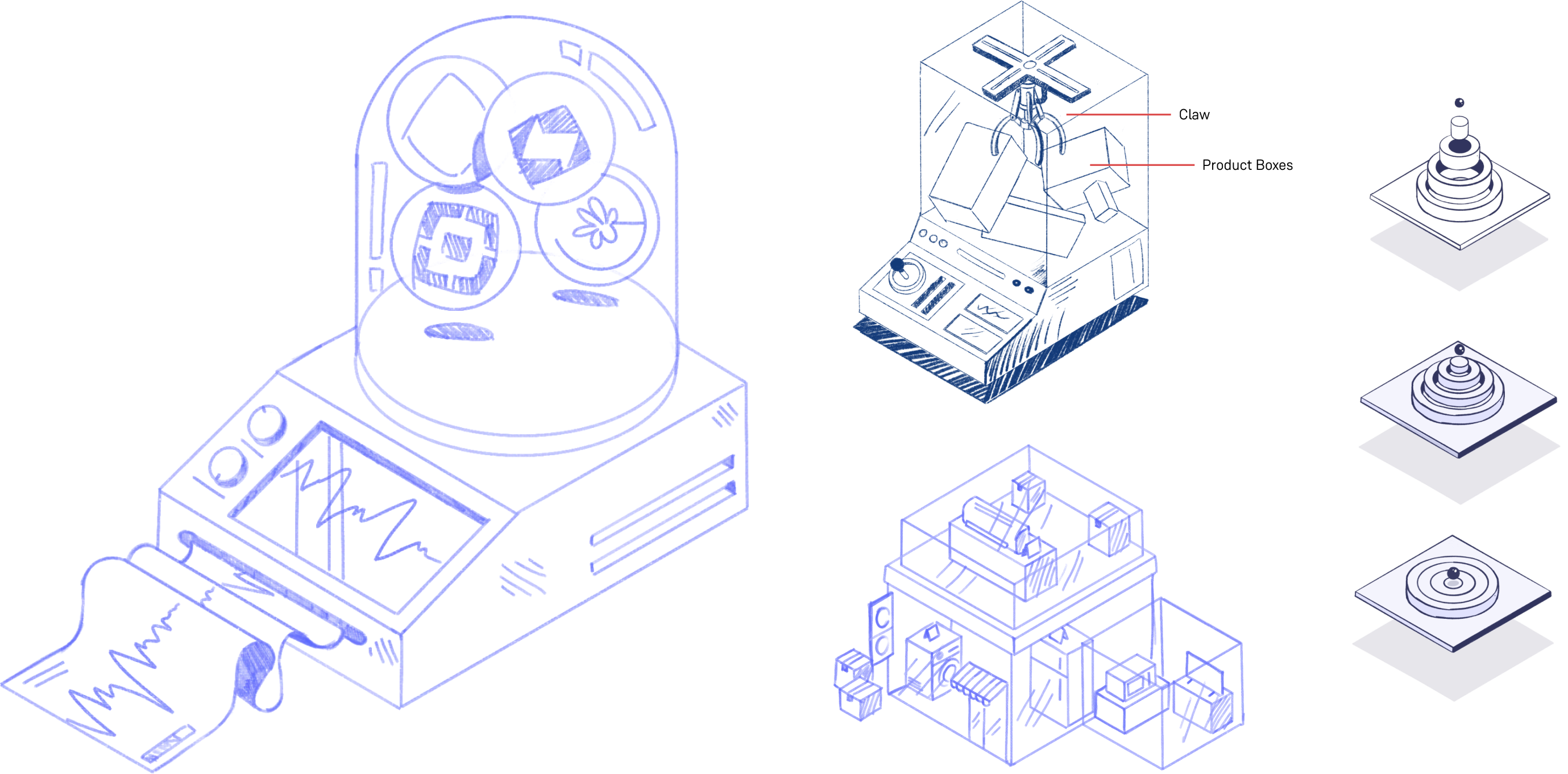
01
Devices
futuristic terminals and machines
02
Architecture
buildings as financial instruments
03
Hybrid
both, woven together
GROWW CREDIT · VISUAL SYSTEM
(07 / 14)
(08) — SPOT & HERO · 01 / 04
Track your Mutual Funds.


(09) — SPOT & HERO · 02 / 04
Loan on Mutual Funds.


(10) — SPOT & HERO · 03 / 04
Personal Loan.

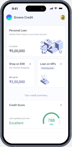
(11) — SPOT & HERO · 04 / 04
Shop offline

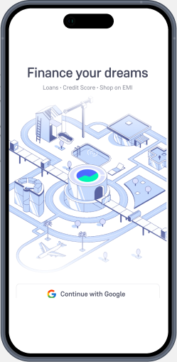
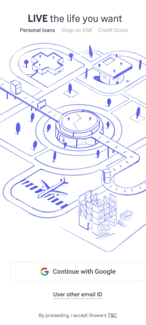
(13) — SPLASH CONCEPTS
From sketch to system.
Early concepts mapped the cityscape in pencil — buildings as financial instruments, signage as product names, all under a 'LIVE the life you want' headline. The vector translation kept the sketchy feel: loose paths, hand-set type, light wash of colour.

(14) — FINAL ILLUSTRATION
Finance your dreams.